1.1.1
I am going to research 4 different digital artist's that I like. the 4 that I have chosen are:
-Nico Di Mattia
-Ferdi Rizkianto
-Jorge Aguliar
-Karina Berdnorz
1.1.2
 Nico Di Mattia
Ferdi Rizkianto The artist has created a shocking picture because of the fact that it shows humans effect on the planet. For example, we presume that when we are using a chopping bored we are cutting up meat or vegetables for meals. Humans willingly take these resources with no thought, because it is normal. When we see the tree on the chopping board with segments of meet, it makes you take another look.
 The Artist has used a colourful theme with a sky blue background and a pink path for the dominoes. This may suggest that it is aimed at women, suggesting that they should stand up for women’s rights.
 The lighting is very good in the picture, you can clearly see that the flower is grabbing the watering can and has a drop shadow underneath it on the water can. However you can’t pick out one on the ground. This maybe because the time of day puts the shadow too far away, however it might be a grey area. If you look closely it seems as though the sun is high in the sky, so therefore there might have to be a shadow on the ground of the plants stem.
1.1.3
I am going to research 4 different digital artist's that I like. the 4 that I have chosen are:
-Nico Di Mattia
-Ferdi Rizkianto
-Jorge Aguliar
-Karina Berdnorz
1.1.2
In this piece of art we can see that Nico has produced a caricature version of “The Joker”. The joker is sat in an alley way of some kind sat on what appears to be an old cardboard box. Nico has presented this image as a type of caricature; we can see this because of the exaggerated features, for example, the size of the jokers head in comparison with his body. There is a wall behind him which he has spray painted with some sort of sad face, and there is also an old, battered steel bin in front of the wall.
The artist has used a paint brush style to the whole image. This gives it more emotion and almost comic feel rather than a photograph. The dark and greasy way that the “Joker” is presented, suggest that he is a villan to somebody who does not know his character. Also the fact that he is in a dark alleyway with a spray can suggest he may be involved in a crime.
The artist has linked the character and the spray paint together by giving the character a spray can. Also the artist has linked them together by using colour. The same colour that is spray painted is also on “the joker’s” mouth.
The way that the picture is presented defiantly gives the picture some impact. The position and posture of “the joker” suggest that he is quite aggressive, at the same time he has a smile on his face giving him a sadistic and weird look. This effect would make you look at the picture twice.
We can also see that the joker has matches in his pocket, as well as having a gas canister on the floor; this brings us back to the fact that he is a criminal.
Ferdi Rizkianto
In this image we can see that the artist has made a comic rendition on humanities effect on the planet. He has done this by using an image of a tree laid on a chopping bored with bits of it cut up. In the segments of the tree instead of bark and wood, the artist has edited them to have flesh or meat inside of them. Also he has added a stream of blood to the segments and it drips off the chopping board. There is also a knife with blood stains on it.
 The artist has created a shocking picture because of the fact that it shows humans effect on the planet. For example, we presume that when we are using a chopping bored we are cutting up meat or vegetables for meals. Humans willingly take these resources with no thought, because it is normal. When we see the tree on the chopping board with segments of meet, it makes you take another look.
An in depth look at this picture tells a story of humans effect on the planet. For example the bleeding tree suggests that humans are killing them and hurting them. Another way that you could look at it would be that they are killing the environment.
The lighting effects on the tree and surroundings are good. It seems that the main light in the area is a kitchen light. Each segment has a drop shadow on it; they all face the same way which gives the picture some realism. The background of the picture is blurred making the tree and the kitchen board the main images of the piece; this makes them stand out.
The knife has a good lighting effect in the way it is lighter at one end and darker of the other. Also the artist has remembered that the knife is a reflective surface and has reflected the chopping board onto the knife. This gives the picture a sense of realism.
Jorge AguilarIn this picture the artist has put a comic feel on standing up for your rights, what you believe in and standing up for yourself. In this image we can see the artist has arranged some dominoes in a s shape all the way into the distance. The domino at the very front of the picture has not fallen down and is still standing even though the rest of them have fallen. At the bottom right of the picture we can see that the artist has put some text there reading “STAND UP FOR YOUR RIGHTS”.
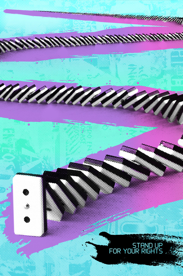
This picture does not use any particular lighting effects. This is mainly because the artist has used a effect over the entire image. There seems to be some kind of affect that pixelates the image. The gives it a cool sense of style and would make it stand out in a magazine.
The fact that the domino in the front of the picture is holding up everything suggest that as an individual you must stand out from the crowd and don follow popular trend. Also that if you are pushed down by others from what you believe you should stand up for what you believe in. we cans also gather that from the way that the dominoes are all being held up by the single domino at the front that not be pushed away from the government and stand up for your rights.
This picture almost has a sort of comic effect to it because you know that the statement “stand up for your rights” is serious, the fact that it has been used in the same image as a domino that will not fall down gives it a humorous effect. Mainly because everyone knows that dominoes is a game and isn’t very serious.
Karina Berdnorz
In this photo we can see that a man or woman has just finished watering her or his garden. They have an old watering can in their hand. The artist has photo shopped one of the flowers actually reaching out to the watering can and grabbing it with an imitation of a hand.
 The lighting is very good in the picture, you can clearly see that the flower is grabbing the watering can and has a drop shadow underneath it on the water can. However you can’t pick out one on the ground. This maybe because the time of day puts the shadow too far away, however it might be a grey area. If you look closely it seems as though the sun is high in the sky, so therefore there might have to be a shadow on the ground of the plants stem.
An in depth look at this picture suggest desperation. For example, only one of the flowers is trying to grab the bucket, suggesting that one maybe a bit braver or even more in need of water. You can see that this picture is defiantly set in the summer time or on a really hot day. This means that maybe the plants are in need of more water.
This picture also has very vibrant colours suggesting that it is a summer’s day. The bright yellows and oranges suggest that the sun is out and it is a hot day. This adds realism to the picture.
This also has a shock value. If the picture was to be up on a billboard then you may look twice or three times before you actually realise what is happening in the photo. As we can all relate to it being a sunny day and being in the garden, this picture adds a comical effect to a normal scene.
1.1.3
I Demand is the concept in which our ideas have to be based around. The guidelines which we have to follow are to:
-send them in high quality, 300 Dpi, RGB, JPG.
-not include self promotion or spam
-set them to this size landscape/550 pix high by 920 pix length portrait/550 pix high by 460 pix length
-use there logo, however it is not mandatory.
Revolution Art seem to use very simplistic ideas as there front covers. using block colours and primary colours.
The theme asks what we could do to save the planet and what would we ask world leaders if we has the chance. we should discuss the government and the environment and give our view on what the majority of the population want. E.g Freedom and safety, as well as a clean and healthy environment.
The images they have used in the demo picture suggest the peoples uprising to power. It suggest unity in people and that its time for a change.
Mind map of ideas


Mind map of ideas

Thumbnail Sketches/chosen idea/summary

1.1.4 

1.2.1/1.2.2
I presented my ideas to a group of people. And I was given feedback.
- instead of having a shield give the Spartan a £10 note.
-the bear might be adding a bit too much to the picture
-indicating two different sides.
I decided that i would give the Spartan an note instead of a shield and also take the bear out of the picture because it might have been too much going on in the picture.
1.2.3
My final idea would still be my preferred idea because I like the concept and i think it would really stand out in a magazine.
No comments:
Post a Comment